Introduction to Internet Marketing Content Studies Pt. 2: Poorly collected data makes for poor analyses

Recap
The real risk of collecting your own data is that you might do it poorly. In which case, you limit your analyses or just make them entirely useless from the beginning.
Earlier this summer, I finished pulling ads from across the web. You can read more about the process here. While the data were not collecting in a scientific fashion, I still wanted to take the opportunity to try to explore it a bit and see what had been gathered.
What I ultimately found was quite frankly nothing much of interest. My initial concern was that the data were gathered haphazardly, but there might be something to note here. My current feeling is that the messy approach to data collection pretty much sunk any worthwhile attempt to gather any additional insights. That is, there’s a lot of duplication that had to be weeded through and even after that, it seems like there’s not much more than a smattering of exaggerated headlines and some bizarre images. For whatever that’s all worth.
Here is a link to the notebook if curious. Below is a brief description, but the notebook contains the whole process.
Exploratory Analysis
As mentioned in part 1, I figured it would be interesting to explore what was collected based on the perceived political bias of the site each ad was found on. So I classified each site as either being predominately Left, Right, Center, or Tabloid. I referenced Allsides where possible, but that was not entirely helpful in all cases. The Tabloid tag is for those sites like TMZ where I don’t think politics is the first concern.
Some obvious first steps to take were to see what kind of headlines we got by political classification. You can see what happened in the notebook, but it’s not entirely fascinating. I did notice that you do get more bizarre headlines by pulling out the less frequent ones. But over all, there wasn’t much interesting on the surface of the headlines by frequency.
Another approach was to see the frequency of headlines that contained a particular subject. For this I just searched for names of presidential candidates in the headline and plotted each in a bar chart grouped by month and by political classification of the site they were found on. With headlines like “Watch Obama’s Face at 0:33. This Leaked Video Will Destroy Obama’s Legacy”, “Trump Voters Shocked After Watching This Leaked Video”, and “Hillary’s Massive Post-election Meltdown Caught on Video” (hypothesizing that clickbait would tend towards the sensational and overall negative rather than something positive about these individuals), I wanted to see where these types. Here is the plot for “Trump”.
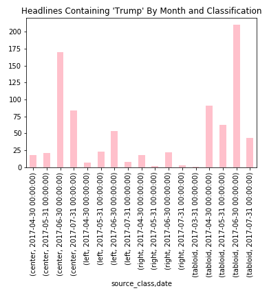
It’s interesting to note that most mentions of Trump in native ads appeared on Center or Tabloid websites. Though this chart also indicates a trend that will affect the rest of these charts - an unevenness in the data collection over time. You can see here that the highest counts occur in the month of June. This is probably when I was collecting from most websites and more frequently than other months. Because I was adding and removing websites during the collection, I feel like this kind of muddied the data and makes it much less appropriate for analysis of trends over time.
Nonetheless, looking at the other candidate, we notice something else interesting.
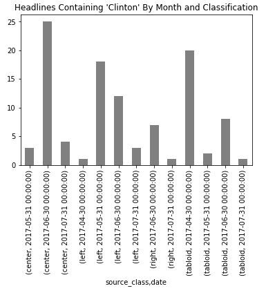
I had started by looking at the same distribution for “Clinton”, but found those counts to be rather low compared to “Trump”. But that her counts were more evenly distributed across left, center, and tabloid websites was interesting (in that there was comparatively very low appearance on right websites).
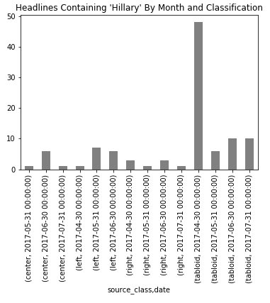
But if look for the string “Hillary”, we see a different picture of Hillary Clinton mentions in native advertising popping up mostly on tabloid websites and very little in other types of websites.
Finally, we add Obama for the complete picture.
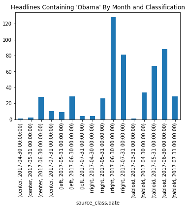
Here it’s pretty much what we expected: mostly appearing on right leaning and tabloid websites.
Other than this, I took a stab at seeing what were some common (and not so common) click bait images to appear by political classification, but none of it really seemed terribly interesting.
Conclusion
So after some exploration, I’m calling it a wash. Overall, this has turned into a true rat hole of a project. It was valuable to learn a little bit more about headless scrapers and native advertising in general, but getting any kind of signal out of this information has gone on a lot longer than I anticipated and in the end started to feel like squeezing blood from a turnip. Again this is for a number of reasons:
- Data collection here was so stop and go and evolving over time, that the results above are pretty unscientific
- Data collection itself was stymied by a issues with sites potentially blocking the scraper, the scraper breaking down regularly, and sites changing their layout frequently enough to require multiple updates to the scraper
- Since the data collection was so poor, any trends in the data are crowded out by inconsistent or overly redundant data collection
If I had more time or energy for this project, I might dig deeper into things like exploring the image patterns by performing some neural network analysis. There might also be some interesting patterns in the text. But as mentioned in the previous post on this, this is not new territory, and has probably already been done better.
In any event, I am making the data available here for others to play around with if they would like.
It was an interesting journey, and I am glad I took it. But I think it is time to lay this project to rest. It’s OK to admit when things like this go wrong, and it’s certainly a lesson learned in being careful to make sure that when you collect data, that you do it correctly for the analyses you intend to perform.