The Special Collection in the Age of Digital Reproduction - Digital Libraries Part I
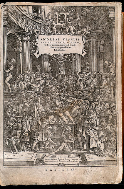
Where I work, a common focus is on how to put books like the one below online for the public to view from a web browser.


While making the initial explorations for a recent project involving the digitization of some rare books, I wondered what it is that makes for a satisfying user experience when it comes to handling digitized books, particulary rare books. These books are in and of themselves as much works of art as they are vehicles for information.
Putting the book and its conveyance into historical perspective is an article from the Atlantic that discusses how paginated books only make up a part of the history of written texts. And as we move into a time of increasing digital reading material, the page marker gives way to other forms of breaking up and pointing to parts of a text.
In the context of the cultural institution (to say nothing of e-books and e-readers), there are already a few different open source book viewers that take on the display of texts for which the text is not the only important feature. What I’ve found so far (as possible client end solutions for sharing our digital collections) are: The Internet Archive/OpenLibrary BookReader; The Library of Congress’ World Digital Library Viewer; The Wellcome Library Player; and The New York Times/DocumentCloud Document Viewer (only to name a few). They all appear to be great options and all appear to have fantastic documentation and demos on their respective sites.
Each of these, and other viewers online, have their individual design decisions as they were all built with slightly different general use cases in mind. Some have the book paging facsimile, showing both pages side by side and approximating the movement of pages being turned, some do not. Some offer a paging animation clicking on the pages themselves, some only buttons in a control panel, making for a more fluid mobile/touchscreen experience. Most of them zoom. What we might be seeing though is the settling of a grammar for interacting with digital book displays.
And they do share a few commonalities that point towards the future of viewing books (or paintings, or documents or even videos and audio files) online. Many of them have full text search. Most have the option to view pages as thumbnails to more easily browse through an entire book at a glance. Some provide windows for tables of contents and object metadata.
Though in reviewing these different viewers, I am asking myself what it is that would make a book in digital format true to its historical character, true to its character as a physical, primarily analog artifact, but also useful and compelling in the context of a contemporary, digital experience.
While I acknowledge the desire to have the same interaction at the digital level as I would at the analog level, I don’t feel, for instance, that the page turning approximation in some of the players really added very much to the experience. Instead, I almost feel as if it removes and distracts from the experience. //Perhaps it’s me thinking the entire time, with my particular point of view and the fact that ultimately I will be the one responsible for implementing this solution technologically: “How would one get this to work on a code level? Will it be too tricky to get the pages to turn given other design decisions?” And in that, I am distracted and, while drawn in by the marvel of seeing the pages turn digitally, I am no longer paying any attention to the work being represented. It’s there, but I am too caught up in the technology.//
Sometimes being caught up in the technology is the goal. It is as noted in another blog post I came across recently about UI experiences: “Sometimes their efforts create UIs that scream “Look at how advanced our software is! Come join us in the future!”. As though some UIs exist to liven up underwhelming content.
But for special collections, rare books that compel in and of themselves, we want to grant access and accentuate their best features (seeing the texture of the paper and the printing impressions, seeing the images and illuminations, being able, of course, to read the text) without calling too much attention to the technology used to display them.
When making design decisions, no matter what, you have to leave out somethings, and include things at the expense of other features or affordibilities. Often these decisions come down to a matter of time, money, or conviction (and maybe the persuasion by certain stakeholders). So I am not sure if I am correct on this or not, or if there is any correct answer. But with that I’ll continue to document what follows.